Survey websites, recent books, and visualization practitioners and researchers on twitter.
visualization design resources
A not so current (as of Sept. 2015) and incomplete list of resources for visualization design, biased toward resources used by or familiar to members of the UBC InfoVis group.
jump to: choosing vis tools | inspiration | data repositories | data wrangling + eda | vis design | sharing your work
 Image: wikimedia commons.
 Image: treevis.net
Visualization Survey Websites
Interactive meta-visualizations based on surveys of existing visualizations and/or technical papers.
→ keyvis.org: survey by journal/conference keywords by P. Isenberg et al.
→ Multifaceted scientific vis survey by J. Kehrer and H. Hauser.
→ The data visualisation catalogue
by data abstraction:
→ Tree vis survey by H.-J. Schulz.
→ Tree vis survey with brushing + linking by M. Adil Yalçin.
→ Set vis survey by B. Alsallakh and L. Micallef.
→ Text vis survey by A. Kerren's Isovis group.
→ Time vis survey by W. Aigner et al.
→ Dynamic graph vis survey by F. Beck et al.
→ Space-time-cube vis survey by B. Bach et al.
by domain:
→ Performance vis survey by the UC Davis IDAV.
→ Software reuse vis survey by M. Schots
→ Finance vis survey by M. Dumas et al.
→ Wikipedia vis survey curated by hatnote.
→ Newsvis: the directory of news visualizations, curated by R. Kosara.
→ Interactive graphic work of the Guardian and the New York Times, curated by M. Rooze.
→ Gallery of concept visualizations, curated by J. Horowitz. See also Explorable Explanations, curated by N. Case.
→ Biology vis survey, curated by J. Kennedy and BiVi.
by platform:
→ MobileVis survey by Irene Ros and Bocoup. Also see the Mobile infovis survey by Sebastian Sadowski.
→ A list of data physicalizations (physical visualizations) by dataphys.org.
 Image: Visualizing Data (A. Kirk)
Recent Books About Visualization
Recently published books discussing / showcasing the state-of-the-art in interactive visualization.
→ Visual Insights: A Practical Guide to Making Sense of Data by Katy Börner and David E. Polley (MIT Press, 2014).
→ The Book of Trees by Manuel Lima (Princeton Architectural Press, 2014).
→ Design for Information by Isabel Meirelles (Rockport Publishers, 2013).
→ The Functional Art: An Introduction to Information Graphics and Visualization by Alberto Cairo (New Riders, 2012).
→ Visual Complexity: Mapping Patterns of Information by Manuel Lima (Princeton Architectural Press, 2011).
→ R. Kosara's reviews of vis books.
→ Visualizing Data (A. Kirk)'s list of references.
 Image: datastori.es/
A podcast on data visualization with Enrico Bertini and Moritz Stefaner.
 Image: @chriskwan
Videos
 Image: twitter.com
200+ vis researchers and practitioners on twitter
A public list of people tweeting about information visualization, visual analytics, information graphics, statistical graphics, visual perception, and data science in general. Compiled by @mattbrehmer.
 Image: wikimedia commons
Publicly available data repositories / directories.
 Image: enigma.io
Billions of public records published by governments, companies and organizations. Free access plan available for non-commercial and open source use.
 Image: dreamtolearn.com
"Statistics about pretty much every boardgame ever released" by M. Zelnik.
Amazing weekly newsletter of interesting/quirky datasets
by Jeremy Singer-Vine.
→ browseable weekly lists
→ single master spreadsheet with everything
 Image: visualizingdata.com
Visualizing Data's list of data sources
Compiled by A. Kirk of Visualizing Data. Select the 'Data Sources' tab.
Datasets from the annual Visual Analytics Science and Technology conference challenge contest.
→ VAST Challenge 2021→ VAST Challenge 2021
→ VAST Challenge 2020
→ VAST Challenge 2019
→ VAST Challenge 2018
→ VAST Challenge Links 2006-2017
→ Repository of previous VAST and InfoVis contests 2002-2006
→ Visual Analytics Benchmark Repository with direct links to Challenge datasets from 2003-present
 Image: data.gc.ca
Open government data
Download census data, tables, and reports in various formats. Similar services exist in many other country / province / state / municipality jurisdictions, such as:
→ World DataBank: explore data about development in countries around the world (education, energy, health, urban development), view data with their own vis tools, and download datasets.
→ Statistics Canada
→ data.gc.ca
→ DataBC
→ OpenDataBC
→ City of Vancouver Open Data Catalogue
 Image: wikimedia commons.
Resources and tools for managing, wrangling, cleaning, and transforming data, as well as for exploratory data analysis (EDA).
 Image: propublica.org
"OpenRefine (formerly Google Refine) is a powerful tool for working with messy data: cleaning it; transforming it from one format into another; extending it with web services; and linking it to databases like Freebase."
 Image: Fusion Tables
"Fusion Tables is an experimental data visualization web application to gather, visualize, and share data tables."
 Image: blog.scraperwiki.com
Web scraping with ScraperWiki, morph.io, and kimono
Browser-based web scraping (in Python, R, Ruby, etc.) and data analysis tools with ScraperWiki: schedule recurring scraping and append to previously scraped data. Also check out morph.io, another web-based scraper with GitHub integration, or kimono, a web-based scraper that doesn't involve writing any code.
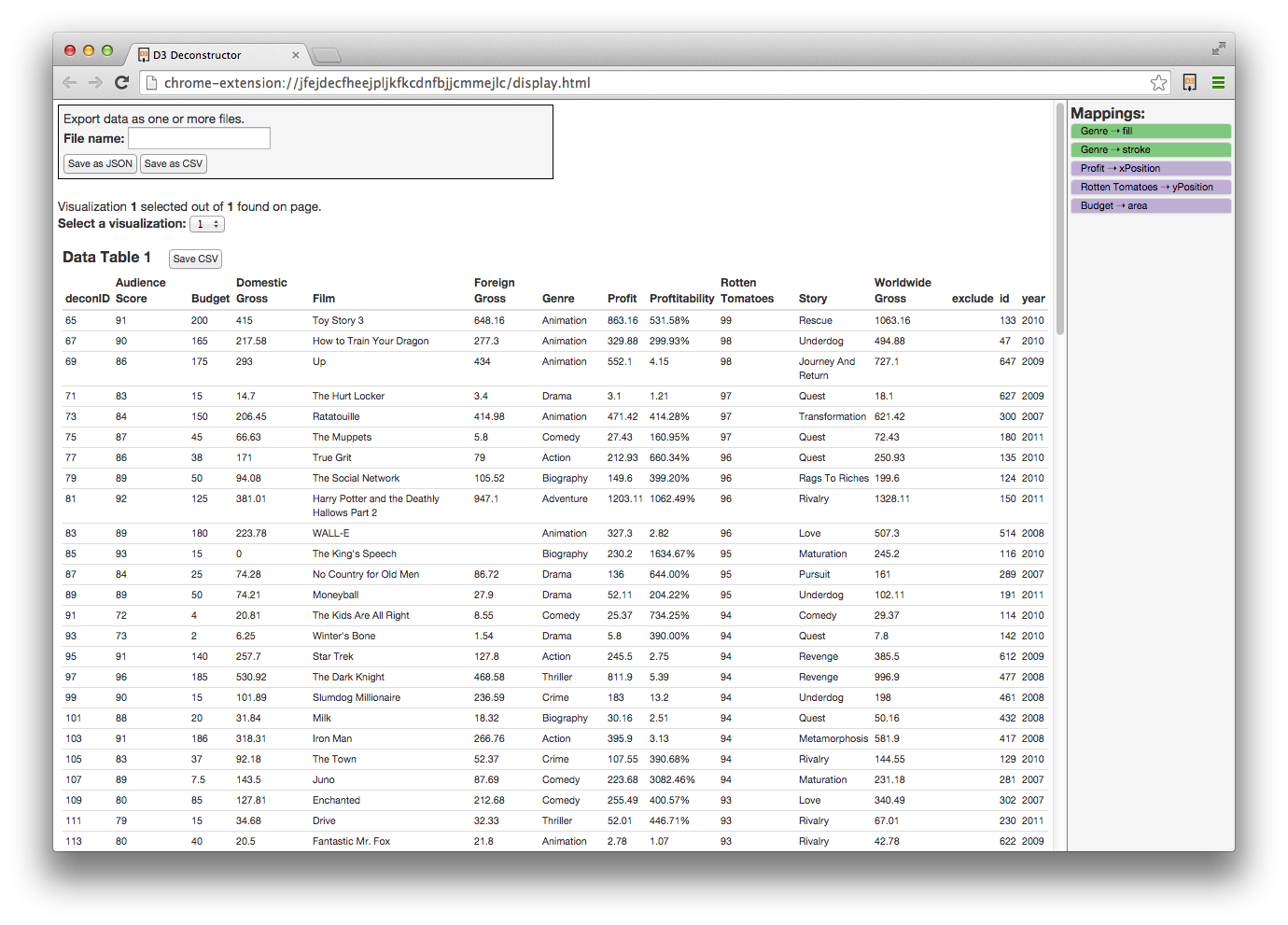 Image: ucbvislab.github.io
From the UC Berkeley Visualization Lab, "the D3 Deconstructor is a Google Chrome extension for extracting data from D3.js visualizations."
From the Bocoup Data Visualization Team: Learn JS Data: Data manipulation, munging, and processing in JavaScript… This guide teaches the basics of manipulating data using JavaScript in the browser, or in node.js. Specifically, these tasks are geared around preparing data for further analysis and visualization."
From the UW Interactive Data Lab, datalib is "a JavaScript data utility library. It provides facilities for data loading, type inference, common statistics, and string templates."
 Image: dat-data.com
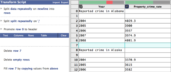 Image: vis.stanford.edu
"Wrangler is an interactive tool for data cleaning and transformation. Spend less time formatting and more time analyzing your data." Wrangler was a project from S. Kandel and the Stanford vis group, and has evolved to become part of Trifacta's product offering.
 Image: vis.stanford.edu
Like Wrangler, Profiler and Datavore are projects from S. Kandel and the Stanford vis group. Profiler is "a visual analysis tool for assessing quality issues in tabular data… a system for integrated statistical and visual data analysis", and is supported by Datavore, a "small, fast in-browser database engine written in JavaScript".
 Image: PAC2 via wikimedia commons
R + RStudio + some useful packages
The R statistical programming language and the RStudio IDE are powerful tools for data analysis, management, and transformation.
→ Learn R , in R with Swirl: "swirl teaches you R programming and data science interactively, at your own pace, and right in the R console!".
→ Learn about EDA with R with course materials from J. Bryan's graduate course on Exploratory Data Analysis (UBC STAT 545) (F2013 course materials) and her R Graph Catalog R/Shiny app (with J. Zhao).
→ Learn R with course materials from J. Leek's Data Analysis Coursera course.
→ "Tidy Data", a helpful article by H. Wickham.
→ Especially useful packages include reshape, dplyr, data.table, and ggplot2.
→ DataJoy: "Easy to use, online data processing with Python and R."
Python + pandas + matplotlib
Data analysis using the Python programming language, the pandas data analysis library, and plotting with the matplotlib library.
→ DataJoy: "Easy to use, online data processing with Python and R."
 Image: mathworks.com
 Image: twitter.com/beakernotebook
"Beaker is a notebook-style development environment for working interactively with large and complex datasets. Its plugin-based architecture allows you to switch between languages or add new ones with ease, ensuring that you always have the right tool for any of your analysis and visualization needs."
 Image: datavisualization.ch
Applications and programming languages or libraries for various stages of visualization design.
similar surveys:
→ datavisualization.ch's 2012 survey of programmating- and non-programmating-based visualization tools, including those related to maps, those for creating basic charts, data manipulation and wrangling, and color.→ Visualizing Data (A. Kirk)'s interactive resource list; filter by tools relating to several tags, including data handling, charting, programming, multivariate, mapping, web-based, specialist, colour.
→ Scott Murray's list of alternatives to D3.js: "D3 might not be perfect for every project. Sometimes you just need a quick chart and you don’t have time to code it from scratch. Or you might need to support older browsers and can’t rely on recent technologies like SVG."
→ J. Heer's useful resources list for the University of Washington's graduate course on Data Visualization (CSE512) (Spring 2015).
→ M. Adil Yalçin's faceted Keshif browser of Data-Visualization Tools and Books.
→ Tools and Libraries for Building Web-based Data Visualisations by P. Cook.
→ New [data visualization and infographic creation] Tools and Resources of 2014 by Visualoop.com.
 Image: balsamiq.com
Windows / Linux / Mac OS X application for developing non-interactive "sketchy" wireframes ($80 USD).
 Image: axure.com
Windows / Mac OS X application for developing interactive mockups without programming (free for students).
 Image: omnigroup.com
OS X application for drawing diagrams ($60 USD for students). Similar to MS Visio.
 Image: tableausoftware.com
Windows / Mac OS X application for data analysis and developing interactive visualization dashboards, with ability to publish online (free for students, 1 year license).
→ Tableau Public, a free platform for publishing "data stories" on the web.
→ Tableau free training tutorial videos.
 Image: wikipedia
"Plotly is an online analytics and data visualization tool. Plotly provides online graphing, analytics, and stats tools for individuals and collaboration, as well as scientific graphing libraries for Python, R, MATLAB, Perl, Julia, Arduino, and REST." - Wikipedia (Enterprise and education pricing available)
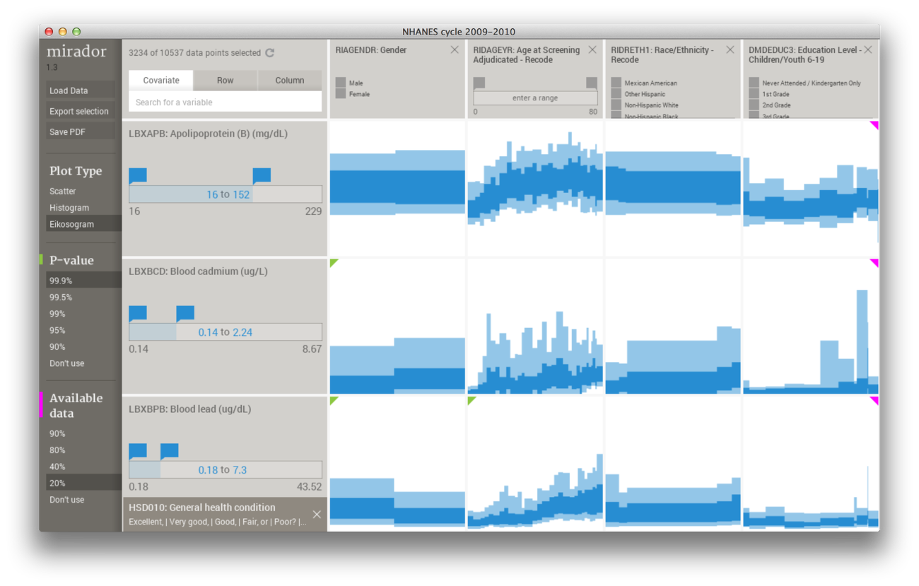 Image: fathom.info/mirador/
"Mirador is a tool for visual exploration of complex datasets. It enables users to discover correlation patterns and derive new hypotheses from the data." (desktop application for Windows / Mac)
 Image: raw.densitydesign.org
 Image: blog.datawrapper.de/
"Create charts and maps in just four steps. [Datawrapper] reduces the time you need to create visualizations from hours to minutes."
 Image: manyeyes
IBM's Many Eyes
Web-based application for exploring and creating visualizations from existing or uploaded datasets. Requires Java plugin.
Image: Fusion Tables
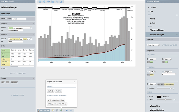 Image: idl.cs.washington.edu
U. Washington Interactive Data Lab's web-based visualization design environment, proposed in a 2014 EuroVis paper by A. Satyanarayan and J. Heer.
→ Lyra was inspired in part by a Feb. 2013 Stanford Seminar titled "Drawing Dynamic Visualizations" by Bret Victor.
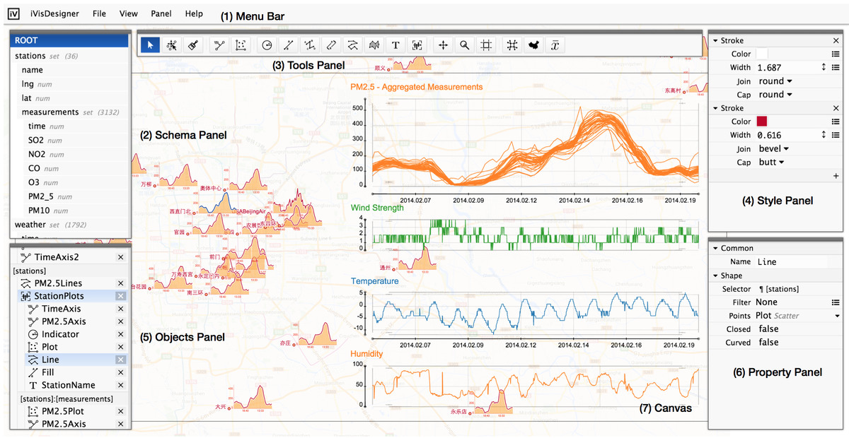 Image: donghaoren.org
D. Ren's's web-based visualization design environment, proposed in a 2014 InfoVis paper by D. Ren, T. Hollerer, and X. Yuan.
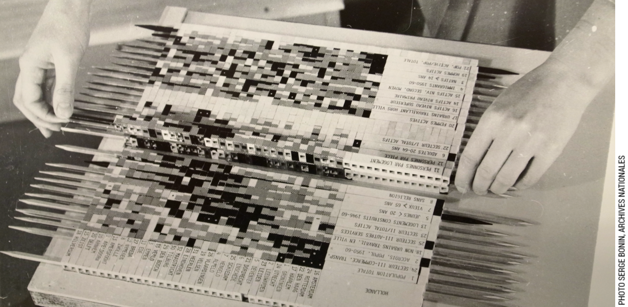 Image: aviz.fr/bertifier
A web-based tabular visualization design environment absed on Bertin's matrices (see image to the left), proposed in a 2014 InfoVis paper by C. Perin, P. Dragicevic, and J.-D. Fekete.
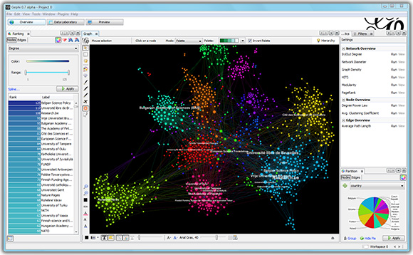 Image: gephi.github.io
Windows / Linux / Mac OS X application for graph visualization.
 Image: nodexl.codeplex.com
 Image: d3js.org
D3.js (Data-Driven Documents) is a Javascript Library for "manipulating documents based on data". Since appearing in a 2011 InfoVis research paper by M. Bostock et al., D3.js has become a standard for developing custom data visualization online. No browser plugins required; each mark in a visualization has a corresponding SVG element, and styling is handled using CSS.
The precursor to D3.js was Protovis (a 2009 JavaScript library by the same authors). Earlier predecessors include prefuse (2005) and Flare (2008), which required Java and Flash browser plugins, respectively.
→ Let's make a bar chart: M. Bostock's introduction to d3.
→ Three little circles: M. Bostock's introduction to d3 selections.
→ Learn the basics of D3.js with Scott Murray's free ebook Interactive Data Visualization for the Web (O'Reilly, 2013).
→ Learn the basics of D3.js with Dashing D3.js's free online tutorial: 20 short lessons in 2 parts: "From Zero to Binding Data" and "Using Data to Create Data Visualizations".
→ Data Visualization and Infographics with D3.js: A MOOC taught by Alberto Cairo and Scott Murray.
→ D3 on AngularJS: Create Dynamic Visualizations with AngularJS: An ebook by Ari Lerner and Victor Powell ($20 USD).
→ List of D3.js tutorials, from introductions of core concepts to specific techniques.
→ M. Bostock's bl.ocks.org directory of advanced d3.js code examples and recent his portfolio, which includes his recent work at the NYT.
→ D3 Deconsructor is a Google Chrome extension for extracting data from D3.js visualizations.
→ Cubism.js: a D3.js plugin for visualizing time series data.
→ Crossfilter.js: a D3.js plugin for visualizing large multivariate datasets.
→ Textures.js: SVG patterns for Data Visualization.
→ d3-gridding is a D3 plugin for nested and partitioned visualization mockups
→ d3-annotation is a D3 plugin for adding built-in or custom annotations
 Image: fathom.info/salaryper
Processing is a Java-based programming language which has been used extensively for data visualization since its inception in 2001. Requires a Java plugin to be viewed in a web browser.
→ Learn Processing with Visualizing Data: Exploring and Explaining Data with the Processing Environment by B. Fry (O'Reilly, 2008).
→ Processing.js: a JavaScript library that converts Processing code into JavaScript such that it can be viewed in a browser without any plugins. No knowledge of JavaScript required; by linking to processing.min.js in your HTML header, your *.pde Processing files are linked and rendered in a canvas element.
→ The Handy library: hand-drawn sketchy rendering for Processing, described in a 2012 InfoVis paper by J. Wood et al.
→ P5.js: a new (Aug. 2014) JavaScript library with a great demo video that "starts with the original goal of Processing, to make coding accessible for artists, designers, educators, and beginners, and reinterprets this for today’s web". Code is written in Javacript and marks are rendered inside a canvas element. Additionally, the p5.dom library "makes it easy to interact with other HTML5 objects"; see this tutorial. Also see this tutorial on setting up p5.js with node.js and socket.io. Finally, watch this OpenVisConf talk.
 Image: shiny.rstudio.com
Shiny is an R package used to generate web applications containing interactive data analysis and visualization elements. No knowledge of HTML, CSS, JavaScript is required. Code is written in R.
→ Learn Shiny RStudio's 7 lesson tutorial.
→ Include static visualizations made with the ggplot2 package.
→ include dynamic visualizations made with RStudio's ggvis package (rendered with Trifacta's Vega visualization grammar).
→ include dynamic visualizations made with R. Vaidyanathan's htmlwidgets package.
→ include interactive geospatial visualizations made with RStudio's leaflet package.
→ Include dynamic visualizations made with the rCharts package by R. Vaidyanathan, an R interface for Polychart.js, Morris.js, NVD3, xCharts, HighCharts, and Leaflet.js. Also see this article about combining rCharts with D3.js.
→ Include animated visualizations made with the animint package.
→ G3Plot: a Shiny application and "demo of Intel's g3plot API (BSD licence) using standard R data sets.
→ "The OpenCPU server provides a reliable and interoperable HTTP API for data analysis based on R. […] the OpenCPU JavaScript client library provides the most seamless integration of R and JavaScript available today […] OpenCPU uses standard R packaging to develop, ship and deploy web applications."
 Image: trifacta.github.io/vega
Trifacta's "Vega is a visualization grammar, a declarative format for creating, saving and sharing visualization designs. With Vega you can describe data visualizations in a JSON format, and generate interactive views using either HTML5 Canvas or SVG."
→ Read the "Reactive Vega" 2015 InfoVis paper by A. Satyanarayan et al from the UW Interactive Data Lab.
→ Graphics generated using RStudio's ggvis package (described above) are rendered with Vega.
→ The Lyra Visualization Design Environment (described above) is also built atop of Vega.
→ "Vega-Lite is a high-level grammar of interactive graphics. It provides a concise JSON syntax for rapidly generating visualizations to support analysis."


Visualizations with React
→ "react-vis is a collection of react components to render common data visualization charts, such as line/area/bar charts, heat maps, scatterplots, contour plots, pie and donut charts, sunbursts, radar charts, parallel coordinates, and tree maps."
→ Semiotic is also a visualization framework for React but uses a different approach. Instead of providing a set of generic chart types, Semiotic uses a layer model to separate interactive and annotation elements from graphical elements representing data.


 Image: www.bram.us
Two.js by Jono Brandel "is a two-dimensional drawing API geared towards modern web browsers. It is renderer agnostic enabling the same API to draw in multiple contexts: SVG, Canvas, and WebGL."
 Image: stemkoski.github.io
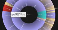 Image: philogb.github.io/jit/
JavaScript InfoVis Toolkit and PhiloGL.
The JavaScript InfoVis Toolkit (JIT) and PhiloGL were developed by N. G. Belamonte. The JIT is intended for "Web Standards based interactive data visualizations", while PhiloGL is a "WebGL Framework for advanced data visualization, creative coding and game development".
 Image: bokeh.pydata.org
Python, Bokeh, and iPython Notebook
Bokeh is "a Python interactive visualization library that targets modern web browsers for presentation".
iPython Notebook is "web-based interactive computational environment where you can combine code execution, text, mathematics, plots and rich media into a single document".
 Image:
 Basic JavaScript chart Libraries
The following JavaScript libraries are used to generate basic / familiar / reusable charts (bar charts, line graphs, pie charts, etc), without having to specify placement of marks (as in D3.js).
→ Polychart.js (borrows ideas from ggplot2).
→ Morris.js (time-series graphs).
→ NVD3 (built w/ D3.js).
→ HighCharts.
→ Rickshaw (time-series graphs, built w/ D3.js).
 Image: pixabay.com.
Tools and services for presenting your creations online.
 Image: bl.ocks.org/mbostock
"A simple viewer for code examples hosted on GitHub Gist" by M. Bostock.
 Image: techrepublic.com
"Test your JavaScript, CSS, HTML or CoffeeScript online with JSFiddle code editor."
 Image: shinyapps.io
Shiny Server and ShinyApps.io.
A free, open source server for serving multiple R/Shiny applications, or opt for tree online hosting with ShinyApps.io.
Image: tableausoftware.com
 Image: http://dominikus.github.io/
An IEEE VIS 2014 Tutorial by Dominikus Baur and Moritz Stefaner. This tutorial surveys tools and frameworks for deploying visualization online (but strictly doesn't cover visual encoding itself).